


When renovating your home, it is an ideal time to revisit your home’s colors, you have created yourself a blank pallet, so now is the time to add your personality, now is the time to turn this house into a home, now is the time to make it an expression of yourself.
To understand the color wheel will help you understand your home’s color palate.
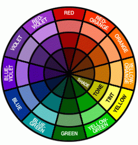
A color wheel organizes the visible spectrum of colors and shows the relationships between them. The color wheel is made of three types of colors; primary: your red, yellow, and blue, Tertiary: your red-orange, yellow-orange, yellow-green, blue-green, blue-violet, and red-violet, and then secondary colors: orange, green, and violet. Within the color wheel are monochromatic colors, such as variations of shades and tints of one color. There are also complementary colors, those are colors that are opposite of each other on the color wheel such as red and green. A Triad is a when you bring all of the primary colors together. Analogous colors are colors on either side of the primary colors are great for accent colors are for use on their own.
Whatever is the size of your home, it can be visually increased with the help of color setting. All the richness and variety of tints can be brought to the seven colors of the basic spectrum that follow each other.
Chromatic Colors:
![]() Red,
Red,- orange,
- yellow,
- green,
- blue,
- dark blue,
- violet
 Red,
Red,Archromatic Colors(i.e. colorless)
- White,
- Gray,
- Black
Now that we have been introduced to the color wheel, let us get started on selecting colors that appeal to you. What colors stand out to you when you are shopping, it can be clothing, foods, or even browsing through magazines? More than likely your favorite colors are also the colors you are most comfortable with; those colors are great options to choose for your home because you want to be comfortable in your home. Please remember that even if you happen to wear a lot of a certain color does not mean that you can plaster that color on your wall, a bright blue may not be as soothing as you might think, but starting at that blue you can take you’re your color wheel out and begin to work around that color until you find the right hue for you wall.
 When you choose the color setting of this or that room of your house, you need to take into the account various factors:
- if the windows face the north, it is better to prefer warm colors,
- if it is the south, then cold colors will be appropriate.
Other factors are the quality of lighting, because the color reflects the light, and the kind of zone (whether it is a kitchen or a drawing-room, a children’s room or a study). Saturated, bright colors are the most suitable for setting of a drawing room or a dining room.
White and blue (associated with cleanness and water) are good for the bathroom, but are not suitable for a kitchen; for a drawing room and a kitchen you’d better choose yellow or orange colors, warm and soft tints of red and white. Besides don’t forget about parameters of the room – bright walls visually decrease the amount of space, while dark ones expand it. For instance, red, orange and yellow can help make a huge room with little furniture look smaller and more comfortable.
Check Out: Bedroom Makeover Ideas for People on a Budget
When you choose the wall color, remember that furniture, soft furnishings and curtains are to be in harmony with the walls. If furniture upholstery, covering on the trestle-bed and curtains are patterned, it is better to make walls plain. Combination of colors is to be approached thoughtfully, do not rely on chance. For example, it is better not to combine red and green, because it is difficult to perceive this combination, especially if these colors are given in equal proportions. Bright yellow can be a good background for any color (in China collections of porcelain were always exhibited against a yellow background). Stencils looks well on a yellow wall. Green poorly matches all colors, except for various tints of the same color.
Many peoples associate red with wealth, luxury and beauty. It is perceived as a symbol of excitement, loud communication, fuss. Well-matched tints of red look well in the hall, kitchen, children’s room, drawing room. If the room is set in cold tones, “patches” of red will make it more comfortable.
Orange is associated with the golden orange. And this means warmth, vivacity, joy. The interior of a cold northern room can be set in orange tones.
Yellow is a very “warm” co lour. If your room is located on the northern side, abundance of yellow in the interior will produce the impression that your rooms are “cheerful”, sunny, even if in fact, sun-rays are rare guests in your apartment. Psychologists think that yellow is suitable for people who have an active walk of life and can easily adapt to any environment. At the same time yellow can irritate, everything depends on a specific tint.
Green is considered to have a calming effect and be good both for eyes and soul. Most likely, it happens, because this color is the closest to nature. Indeed, the canvases of ancient painters, where green tints predominate, “heal” the souls. Green is also considered to be the color of conservatives, perhaps because it was favored in Victorian England. Green looks good in interiors of big and light rooms. In setting of the office, we recommend that you use dark tints of dark blue and green. Various tints of dark blue cause different emotions. Blue is the color of the sky, space, air, freedom. Deep blue conveys a feeling of calmness.
Navy-blue casts sorrow, some peoples consider it to be the color of mourning. Psychologists recommend to use dark blue for a bedroom. Some people are very fond of violent, others abhor it. Violet is thought to be a “magic” color – indeed, it conceals some mystery. Perhaps, the color of the evening sky induces such associations? Artists think that violet has something painful and sad in it. It is better to use light tints of violet in living quarters, as deep and bright tints of violet bring about fatigue.
Gray is the “universal” color, it harmonizes with almost all other colors. Perhaps, it is the favorite color of designers, as it has many tints and is a perfect background. It is calm and neutral, however, it is better to use it in combination with other colors, because sole gray can seem boring.
Finally, black and white. Two poles, two deeply symbolic colors, two extremes, but when combined, they emphasize and shade in each other, and thus create elaborate classics. Both colors are elegant, “universal” and never go out of fashion. We can say that they are beyond fashion.
Black marvelously shades in any color and makes it more expressive. A verandah or a hall, if they are well-lit, can be finished with shining marble panels. Black seems to diffuse the borders of the room. In a bathroom you can use black mirror-like tiles. But take into the account that black absorbs light; abundance of black is possible, only when there is plenty of lighting.
Check Out: Ideas for Decorating a Living Room on a Budget
Everybody loves white, it is the color of freshness, cleanness, coolness, associated with cheerfulness and health. White is indispensable in small poorly-lit rooms. In a bathroom with no daylight, white tiled walls will reflect the light of the lamp, increase the luminescence of the room and visually “draw apart” the walls.
 Of course, there is a great variety of all thinkable color tints. Of greatest importance is your desire to find that very combination that corresponds to your vision of the interior setting. If the color is rightly chosen, it can emphasize the advantage and conceal the defect. Unleash your fantasy. Remember about color properties, when you select the setting. We have already mentioned that it is necessary to take into the account location of the room with regard to cardinal points. If the room faces the south, cold colors can predominate in the setting; if it is the north, choose warmer colors. Calm reserved colors are an ideal background for precious and expensive things. For example, solid furniture and a beautiful picture will look great against a light gray background. The color of the walls should necessarily match the color of furniture upholstery and floor topping.
In the kitchen it is better to use light tones of walls in combination with light furniture. If you want contrast, it can be created by bright dishware on the shelves, bright curtains, a pattern.
 A bathroom, lit by only electrical lighting, looks best in bright tones. It is recommended to use white, pastel, light tints of yellow, green, blue and pink. Sanitary engineering pipes and joints are to painted the same color. In lobbies, corridors and halls you can use contrasting colors for wall finishing. The ceiling can be “drawn down”, if its color is several tints darker than walls. You can use wallpapers with horizontal stripes. The same effect can be reached, if the ceiling and the 30-40 cm of adjacent wall area is covered with a lighter paint.
The ceiling can be “lifted”, if it is painted white, better with a light blue tint. You can also paint or paper the walls up to the ceiling without slats, if horizontal stripes of warm colors dominate the wallpaper pattern.
Saturated warm and dark tones or wallpapers with large pattern contribute to visual minimization of big rooms.
If the room is long and narrow, it is better to paint longitudinal walls in lighter tones, and crosswalls – in darker tones. Then the room will seem shorter and lower. It is effective, if one wall has a different color.
A small room can be visually expanded, using light, but cold colors. Light green, silver gray and light blue will visually expand the room. In small rooms it is undesirable to have dark furniture, dark curtains and carpets with dark tints. It is better to paint the doors in light tones – white, light gray and ivory.
Floor with a light color looks more pleasant, than a dark one. So, make your choice.
Lastly, looking beyond the paint and remembering that a room’s color scheme involves more than paint on the walls, the shades and patterns of your textiles, wood furniture and accessories and affect your color scheme and can make or break your look. Make sure your furnishings support the color scheme. After the basics are in place the complementary accessories can come into play.